An Exploratory Analysis of Rideshare in Chicago
Ridehailing services have significantly changed the transportation landscape since they were introduced over a decade ago. The popularity of these services has several implications, from increased congestion to competing with other modes. In April 2019, Chicago became the first US city to release data on ridehailing services including Uber, Lyft, and Via. The TNC data supplements previously released datasets on taxi trips and Divvy bikeshare. The goal is to better understand the effects of transportation network company (TNC) trips on the transportation system, and ultimately, help inform policy and investment decisions.
The City of Chicago makes the data related to vehicles, drivers, and trips available. The data is anonymous, with trip origins and destinations aggregated at the census tract level, trip times rounded to the nearest 15 minutes, and fares rounded to the nearest $2.50. For this project, I will only use the trips dataset and will only analyze trip patterns for October 2021. More than 5 million trips were taken during this month. With this data, I seek to answer the following questions: When is demand highest? Where do people travel to and from?
When do people travel?
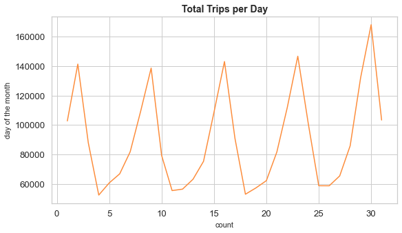
We examined the total number trips for each day in October. From the plot below, we see a cyclical pattern. The demand is highest during weekends, drops during the first half of the week, and slowly picks up towards the middle and end of the week. At its highest and lowest points, the total count remained roughly the same, except during Halloween, where more people used ride share.
The heatmap below shows the trips counts for the month by the hour of the day. The demand is highest late at night or early in the morning.
How far and how long do people travel?
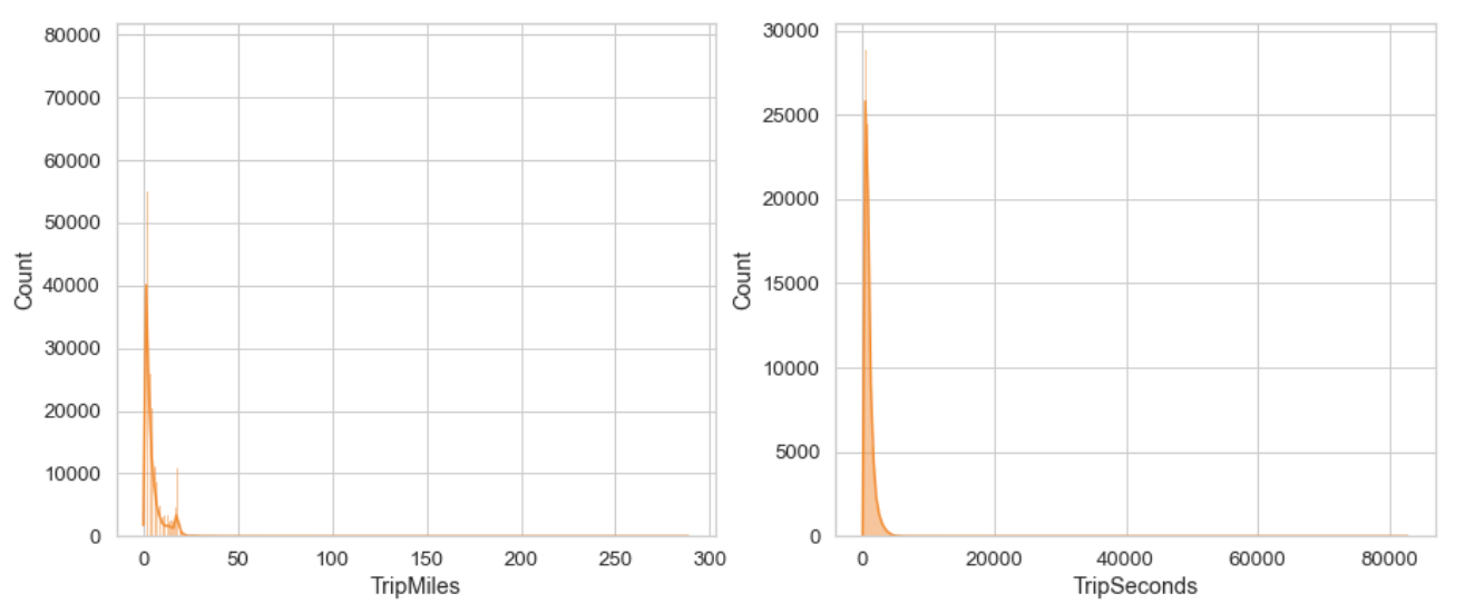
We visualized the distribution of the distance and duration of each trip. The distributions for both are skewed to the right, which means that we have outliers in the dataset. Trips for the month averaged at 4.7 miles and lasted 939 seconds (around 15 minutes).
Which day of the week has the worst traffic overall?
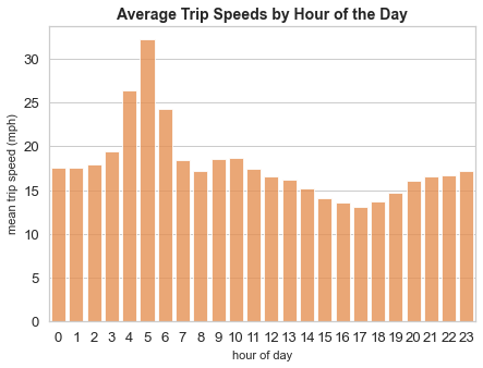
Ridehailing services have been blamed for making traffic congestion worse. We calculated the average trip speed (in miles per hour) as a proxy variable for congestion. During peak hours (ie, 7 to 9 am), we would expect the trip speed to be slower. However, trip speeds are slowest from 4 to 6 am and not during rush hours.
How much do people pay for their trips?
We also looked at the fare by the hour of the day. Surprisingly, fares are also highest from 4 to 6 am. We suspect that this is because of the surge in demand at O’Hare International Airport. We will explore this further in the next section.
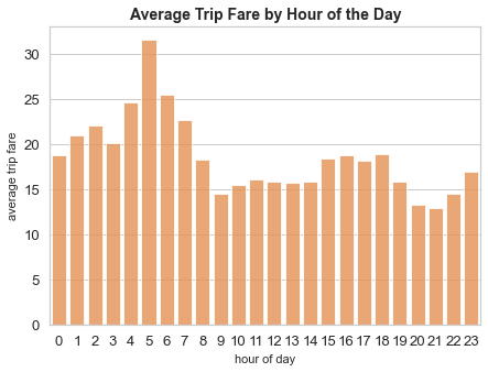
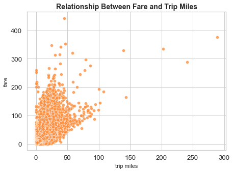
Rideshare users spent an average of $17 per trip in October. Longer distances does not necessarily mean higher fares due to surge pricing or with some passengers opting for larger vehicles, among other factors.
Where do trips begin?
We joined the trips data to the census tracts boundaries downloaded from Chicago’s data portal to get the geometries. The map below shows the count of pickup points by census tracts. Trip origins are mostly clustered around the Loop, O’Hare International Airport in the northwest, and Midway International Airport in the southwest side of Chicago.
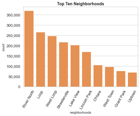
We also merged the trips data to the neighborhoods boundaries in Chicago. The plot shows the top 10 neighborhoods with the largest number of pickup points. Aside from O’Hare, all of the top neighborhoods are in Chicago’s downtown.
Where do trips end?
Dropoffs are also concentrated in the same census tracts, as shown in the map below.
How far do rideshare users travel?
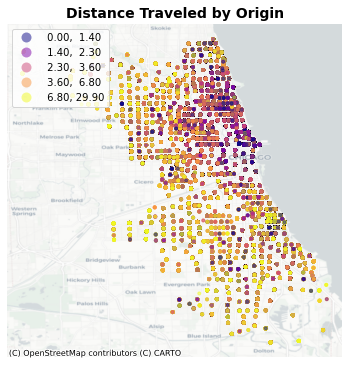
We also looked at the distance distribution based on the origin of rideshare users. Those who are booking a ride near the Loop tend to travel shorter distances, while those with pickup points farther from the downtown have longer trip distances.
How do rideshare trips vary by income?
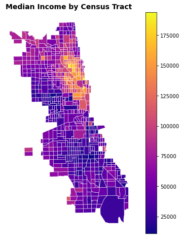
We used CenPy to get income data and merged it with the census tracts and trips dataset. The API query only returned 664 tracts and excludes the far north side (ie, O’Hare), whereas the city’s census tract boundaries has 801 tracts. The map below shows that more affluent households are concentrated in the downtown and northside of Chicago.
Next, we looked at the relationship between income and distance, start hours, and trip counts. Lower income households seem to take longer trips and have earlier start hours.
K-Means Cluster
We clustered census tracts based on rideshare statistics. We took the average trip distances and start hours as well as the total count of trips for each census tract. Using the elbow method, we determined that the optimal number of clusters is 4. The census tracts are colored by their cluster groups. Cluster 2 had the largest number of counts, with 1.5 million rideshare trips for the month. Cluster 3, which had less census tracts but include the downtown and O’Hare International Airport, had 1.2 million rideshare trips in October. Cluster 0, which are census tracts on the fringes of Chicago, had the longest average trip distances at 11 miles. On average, start trips range from 12 to 3 pm.